The Client
A hospital that built its reputation on care, not cost.
Paramitha Hospitals started as a small paediatric clinic in LB Nagar. Over a decade, it grew into one of the most prominent and trusted hospitals in the area, known for personalised care, clinical warmth, and a genuine relationship with the community it served.
That reputation was an asset. But it also carried a perception: Paramitha was approachable, caring and affordable. When they wanted to launch Maathru, a premium maternity brand, that perception became the central challenge to solve.
The Challenge
How do you go premium without going cold?
The risk wasn't just pricing pushback, though that was real. The deeper risk was brand dissonance. If Maathru looked and felt too different from Paramitha, it would confuse loyal patients and undermine the very trust that made the launch possible.
The brief demanded something harder than either extreme: a brand that felt elevated and warm simultaneously. Premium in its experience. Unchanged in its values.
"Maathru had to be premium enough to command a new price point, and warm enough that Paramitha's patients would recognise its soul."
The Brand Story
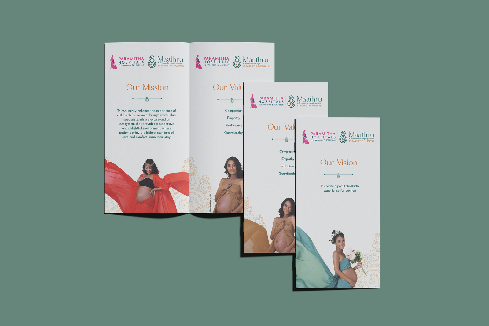
Maathru. A word that carries everything.
Maathru, from Telugu and Sanskrit, means maternal. Not 'motherhood' as a clinical category, but as a state of being: nurturing, unconditional, deeply present.
The name itself did strategic work. It immediately communicated warmth, care and feminine strength, without a single visual element. It gave the brand a soul before anyone saw a logo or walked through a door.
And critically, it carried the same values that Paramitha had always stood for, just expressed at a higher register. The brand story wasn't a departure from Paramitha's legacy. It was its fullest expression.
The Brand Principle
This single idea anchored every brand decision, from the visual identity to the internal environment to the language used in every patient communication. Premium at Maathru means nothing is left to chance in the care of a mother and her child.
What We Delivered
Every layer of a brand, built with intention.
The Creative Challenge
Two brand identities. One family. No dilution.
The most delicate creative decision in this project was how Maathru related to Paramitha. Too close and Maathru would inherit the affordable perception. Too distant and it would feel disconnected, losing the trust equity that Paramitha had spent years building.
ThoughtRadius navigated this by separating visual language while preserving brand values. Maathru has its own identity, its own palette, its own tone of voice. But when you spend time with both brands, you feel the same underlying belief: that care — genuine, attentive, unhurried care, is the most important thing a healthcare brand can offer.
What This Taught Us
The hardest brand brief is the one that has to be two things at once.
Maathru had to be premium enough to justify a new price point and warm enough to feel like an extension of Paramitha's care. Most brands choose one. The creative and strategic challenge of this project was refusing to.
When the brand story is right: when the name, the values, the visual language and the patient experience all tell the same story, premium and warm stop being opposites. They become the same thing.
.png)
.png)
.png)